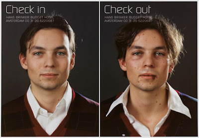
The Hans Brinker is a budget hotel based in the arty heart of Amsterdam. Since its inception in the mid-nineties, the Brinker has grown a reputation amongst designers for its tongue in cheek advertising campaigns.
Usually based around its budget title, each year sees the release of a new campaign championing the Brinkers ‘charms’. As the New Year is fast approaching we thought we’d take a look back over some of our favourite campaigns in anticipation of next years new concept.
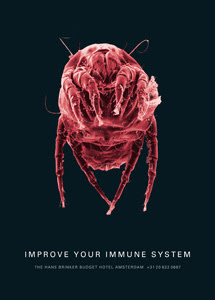
The early posters from 96 were almost conservative in comparism to later pieces, though the use of sarcasm and wit set the trend for all those that followed. The 2004 series were particularly gruesome, depicting various bacteria / bugs with the strapline “improve your immune system”, rather not thanks! You might be thinking why would anyone want to stay somewhere like this? Well, the Brinkers alternative advertising has gained recognition from designers and advertisers alike, worldwide. That’s why so many flock to stay at the Brinker and revel in the “budget” experience.
Our particular favourite is the 2001 series, depicting a filthy old mattress on cold floorboards sitting underneath the strapline “just like home”. The Brinker campaigns show that creative and alternative thinking can be highly successful when attracting new clients. What we need is more alternative ideas like this, making advertising all the more exciting and interesting for it.
We’re all off to Amsterdam now to enjoy a ‘comfortable’ nights stay at the Brinker!
Goede Nacht!


